Grasping Color Harmony
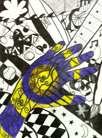
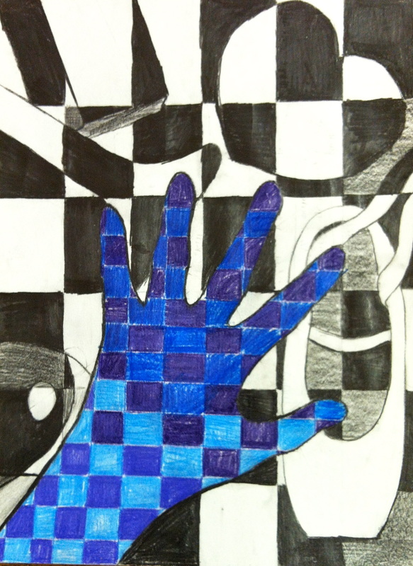
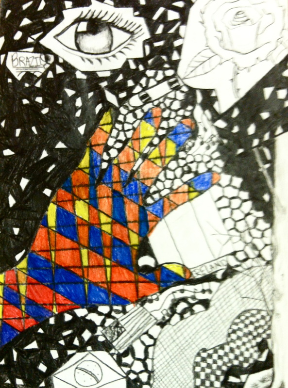
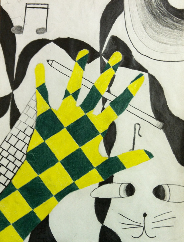
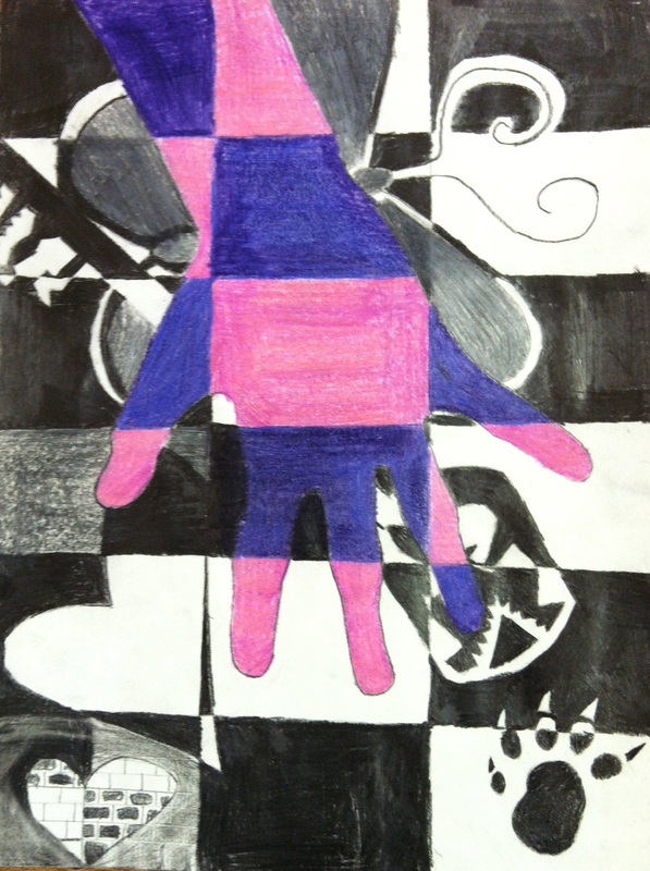
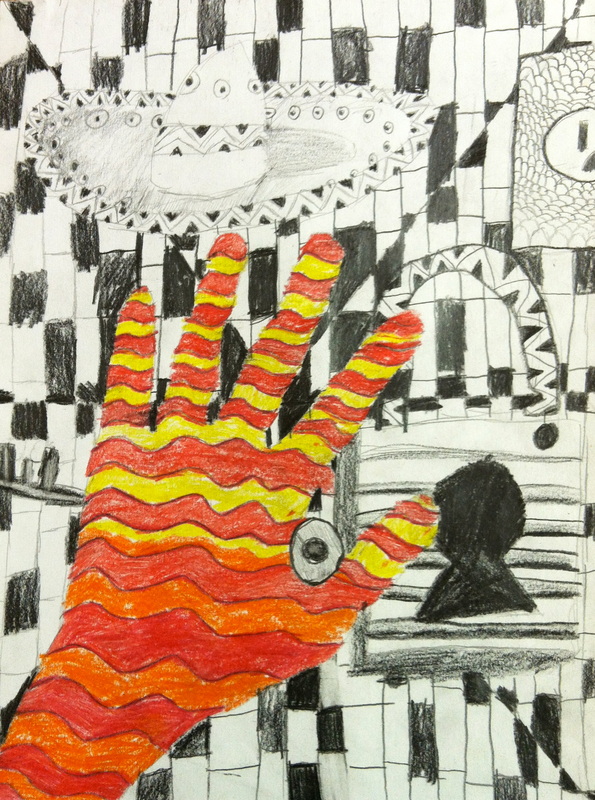
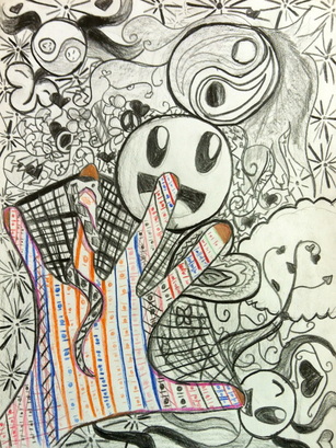
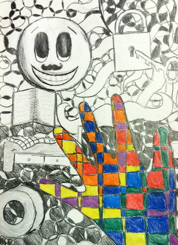
Students reviewed how artists use the fascinating art Element of Color and the design principle of Harmony. This project involved identifying and using basic Color Harmonies to create a mood in a work of art. Symbols were drawn of each students' heritage, culture, favorites, and future goals. The symbols were drawn with graphite pencils with careful attention to adding a full range of values to create contrast in dark and light. The Color Harmony chosen (monochromatic, analogous, complementary), was then applied to the outline of the student's hand with good-quality colored pencils. The color pattern of the hand represents reality of the scholars' hands reaching towards ideas and thoughts that are important in their lives and future goals
|
|
|
|
|
|
The video below shows scholars completing the Contrast section of their project